
A new face To face the future

Setting the tone for tomorrow
Caring about your finances. That's what Brand New Day does. With a broad range of financial products. Such as payment accounts and insurances for both private and business customers. Ensuring the financial future for its customers. Making the complicated understandable. Today and especially tomorrow.
What you see is what you honestly get
Through a clear and optimistic interface, information is presented transparently. Resulting in a sense of trust. We took Brand New Day's personal and customer-oriented approach and translated it into all visual elements. From the choice of typography. To the colour palette and softness in the used shapes.
Visualise your future
Besides the UX, imagery plays a big role in the rebranding. Through the visuals, we created somewhat estranged yet daily situations. These recognisable situations embody the feeling of assurance and relief. From the sketch to concept, to postproduction. All done in-house.
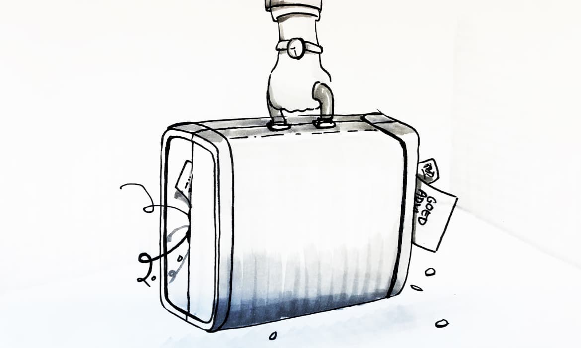


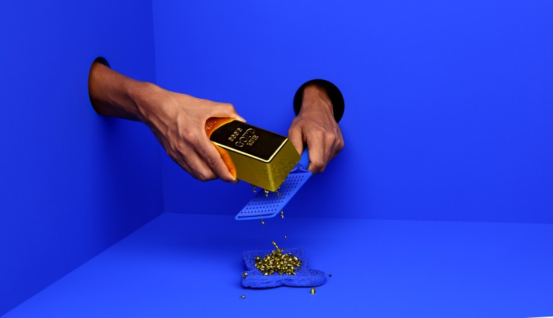

Photography: Aad Hoogendoorn
Knowing what you need
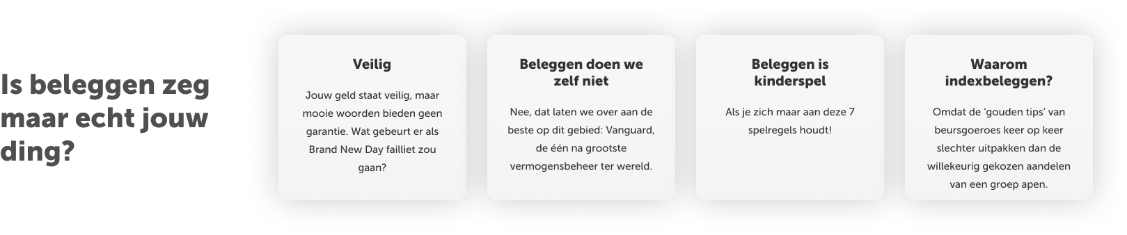
User data showed that the audience needs a lot of in-depth information before making a purchase decision. So we created an overall experience that taps into the intrinsic needs of Brand New Day's audience. They can now easily find in-depth information in an understandable way. Gaining more confidence in making the right financial choices.

Kickass results
Visitors showed us they want to face the future.

More conversion
Less bounce rate
Lower cost per client
Relevant information found quicker
More visitors
More page views


Making a brand new day
Have a look at how we did what we say we did.
Get in touch

Kim de Rotte
Client Service Director