Beautiful & Daring
How would you define beauty? As a society, we can be subjective, but we can also have common norms that lead us to agree that something is beautiful. For example, what do the Pyramids of Giza and Da Vinci’s Mona Lisa have in common with the Twitter and Pepsi logo? They all use the ‘Golden Ratio’. A mathematical equation, that is commonly found in nature and when used in design, it fosters organic and natural-looking compositions that are aesthetically pleasing to the eye. People tend to naturally agree as our brain is wired a certain type of way. So, it becomes a norm of beauty that our sight automatically recognizes.
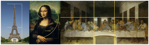
Examples of the Golden Ratio
But apart from the norms of how we could see beauty is there a way to define it? Sagmeister and Walsh, two highly influential Art Directors, who have made it their mission to find out what beauty is, have defined it as: “A combination of shape, form, colour, composition, material, and texture, to please the aesthetic senses, especially the sight ”.
When it comes to something considered daring, there are many ways to look at it. You can have the Jackass type of daring- if it floats your boat. And then you have the Rosa Parks, “Mother of the modern day civil rights movement”, type of daring. That is one powerful type of daring, marking a historical change in the black American history.
In design you can also have different types of daring. For example, some luxury fashion brands have used their campaign platforms to create awareness around a subject others wouldn’t dare to do. Take United Colours of Benetton for example, a simple brand in it’s style but very powerful in it’s communication. They decided to use billboards as a platform to send a message about equality. What better way to create awareness around a subject than by shoving it in people’s faces while they are on their way to work, strolling down the streets or buying their groceries. Something as huge as a billboard, you simply cannot take your eyes off. The brand is not even talking about their clothes, it’s just aiming to do good even if it might receive backlash. That’s one way to be daring.

A Benetton anti-racism advert in Rome, 1996
Accessible & Functional
How to define Accessible and Functional? In a world filled with online products, chances are high your client's target audience can't use the website properly because of a common disorder like ADHD or because of a bad functionality on the website. There are ways to solve this and expand your audience reach.
Why is it important to make your online product or service accessible and functional? Accessibility includes a large target group, think of people who have ADHD, low vision, bad mobility, epilepsy, etc. There are a lot of people who have a condition like this. For them it is a daily challenge to navigate through a website when it's not made accessible. Talking about navigation and usability, if an element/component has a double meaning, it can result in confusion and a high bounce rate. Functionality grows when an element is useful for it's intended use.
Web guidelines have been created for online products and services to comply with accessibility. This is called the WCAG 2.1, Web Content Accessibility Guidelines. Which can be seen as a benchmark. The WCAG 2.1 contains a total of 4 principles, 13 guidelines and 78 success criteria to make this achievable. The 78 success criteria are divided in 3 levels, A, AA and AAA. The AA level is already required since June 2022 for only government related products. For now, starting from 2025 it will be mandatory for all websites. With the exclusion of personal websites like portfolios. This means an online product must tick off at least 50 of the 78 success criteria. Aside from making websites accessible by law, there are more benefits. An accessible website ensures higher quality and increases conversions.
Looking at a functional and accessible online product, the Dutch government website is a good example. The components on the website tell you exactly what the purpose is. However, there is a downside to all of this. So much emphasis has been placed on accessibility and function that the website is not necessarily aesthetically pleasing.
Balancing design at DotControl
As a company filled with UX/UI designers, we always try to combine aesthetically pleasing with daring, whilst keeping it accessible and functional. So how can we balance all the sections out? Can we actually achieve an equal balance between all of them, together? Well, we look at it as a continuously iterating balancing act. That’s because it always depends on the brands intentions. Who is their target audience? Who do we need to speak to and how does the brand need to present itself? Those all are all questions you need to ask yourself when thinking about how to balance those factors out.
Having an aesthetically pleasing and daring website will lure people in. Making it accessible and functional, will include everyone and make it seamless to navigate. However, acing a 100% beautiful, daring, accessible, and functional design is (for now at least) impossible. So what is important to look at? Your consumer's needs and the goal of the website. These will define the balance between all sections. For some the focus will be on accessibility & functionality, while some websites should put the emphasis on the website’s aesthetics more.
Want to discover your optimal balance?
Are you struggling to find the right balance for your website? We love a challenge in finding just the right amount of beautiful, daring, accessible and functional. Get in touch with us to find out how we can help you.